Storyboards and Wireframes: Designing an Autonomous Restaurant
Designed by Kendra Dobson, Kasey Meredith, and Kyle Sellers
Diner-ly and Server-ly are a set of products and software designed with the intention of making the dining experience automated, seamless, and more efficient. Traditional dining experiences revolve around customers arriving at the restaurant, waiting to be seated, waiting to order, and waiting to pay. Diner-ly removes the hold-ups by allowing customers to seat themselves, order their food and cash out when they are ready.
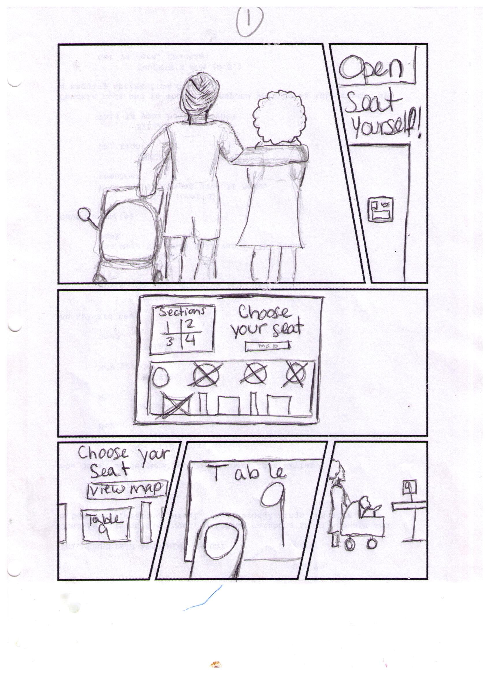
With the Diner-ly experience when diners arrive, they will immediately see a check-in station. The check-in station consists of screens that shoe the customer available tables. They simply choose where they ant to sit by clicking the table on the touch screen, confirm dining, then walk over to the table. The check-in screen will display the tables in a mapping that mimics the same layout of the restaurant making it easy for diners to navigate.
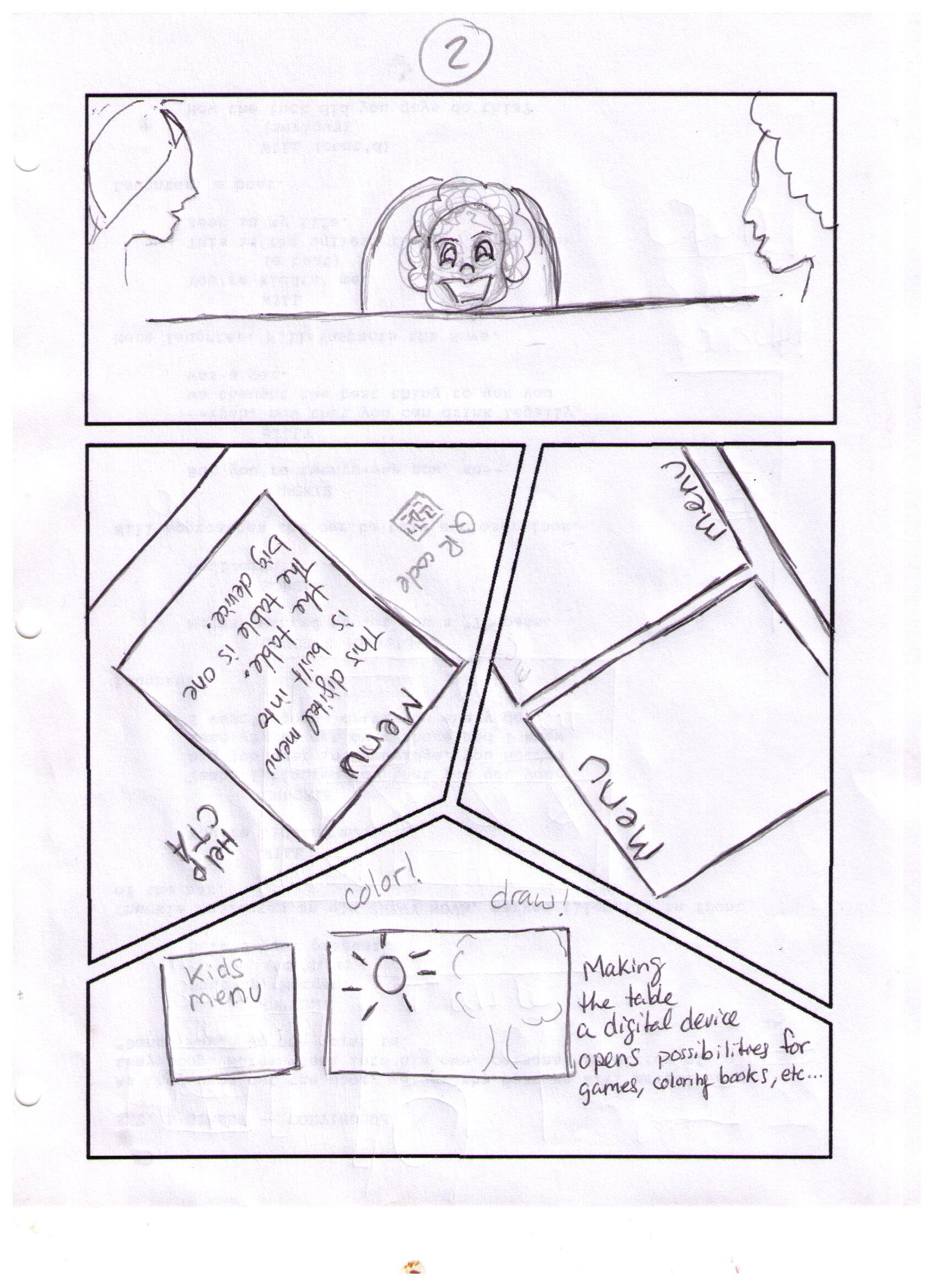
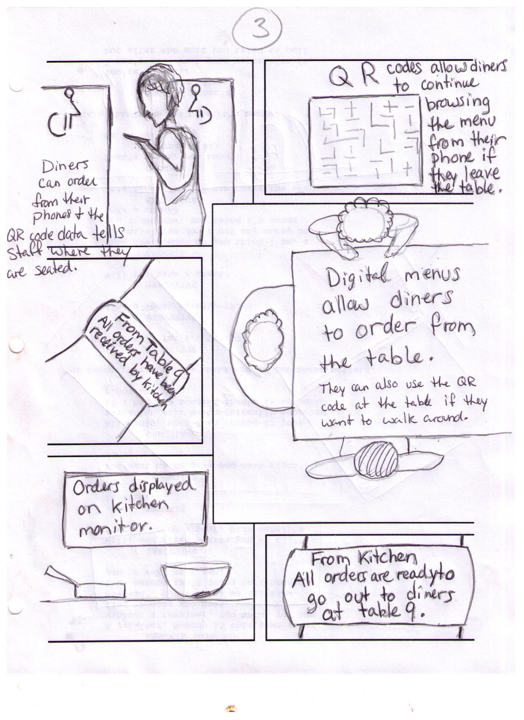
When diners sit at their chosen table, they will notice that the table doubles as a touch screen display, which is one of the main products in the Diner-ly suite. The touch screen display provides a menu for the restaurant and allows customers to order, call the server for help and even pay after dinner is over by using a credit card. Cash customers will need to call the server for assistance. This can be done using the persistent help button that lives on all pages of the Diner-ly software to make it easy for diners to get help fast if they have any questions or concerns.
The second piece of the Diner-ly suite is the Sever-ly watch. The Server-ly watch is to connect servers to all of their tasks. Notifications will be sent to the watch to let them know when food is ready in the kitchen, when diners ask for help, and when diners checkout after dinner. The Diner-ly tabletop and Server-ly watch were designed to improve the dining experience to remove time spent waiting, and have customers start enjoying their dining experience immediately.
The Design Process:
The design of these products started simply with going over the workflow of the dining experience from the customer’s point of view. These workflows turned into storyboards and wireframes. After some more collaboration and a few iterations, they became fully realized products.
The idea was to automate the dining experience as much as possible. We started this process by going through the step by step workflow that diners traditionally go through. It starts with arrival and this is usually when the customer is greeted by the host to be seated. The host seats the diners and then the server comes over to take the customer’s orders and then the server would relay this information (in one way or another) to the kitchen. The server will then need to check the kitchen for the food from time to time until the food is ready. The food is eventually brought out for the customers to enjoy. Once the meal is over the server will need to confirm with the diners that they would not like anything else and then deliver the check. The servers would then need to come back and get the check and either make change or return the credit card to complete the dining experience.
This traditional dining workflow highlights some inefficiencies and areas that can be streamlined. The main interactions that we believed could be automated were seating, ordering, and payment. These interactions are simply transferring information to others. Technology can perform this more efficiently and effectively. Diners can choose their seating, diners can make orders themselves and diners can checkout using a credit card. There is no need for a middleman.
This revelation guided us through different scenarios to come up with the necessary features and functionality for the complete dining experience. Once we figured out the use case scenarios, we built these workflows into storyboards. These features and functionality would be later fine-tuned and perfected in the storyboarding and wire-framing process.
Workflow Diagram Development Process:
In creating a storyboard for our self-seating device, our team storyboard artist started by focusing on two main priorities; story and visuals. Before beginning the storytelling process, she searched for templates online that she could use to structure visuals in an exciting way. She looked for templates that invoked movement by just the layout alone because she knew our story involved showing how information moves from one party to another, and how diners and servers move throughout the restaurant. Movement, therefore, is a major element of the story.
Once she chose about 10 different page layouts that invoked movement, she printed the blank template pages out and spread them out on a surface so that she could see all of them. Then, she began to imagine the story. She knew that the first image she wanted to show would be a full picture introducing the user. Kind of like a user profile in one shot. She knew she wanted the second shot to show the setting, and the third to introduce the technology. With that in mind she glanced over all the template pages she printed out and chose the one that could most adequately frame the images she had in mind.
Following the user flow that our team worked on together, she repeated the pattern of visualizing what was written in the user flow, then picked the template that best fit those images. After sketching the full storyboard, she sent the pencil sketch to the team for feedback. Once feedback was received, she applied changes and finalized the low-fidelity prototype by writing in descriptions next to pictures that were harder to decipher.
Storyboard Development Process:
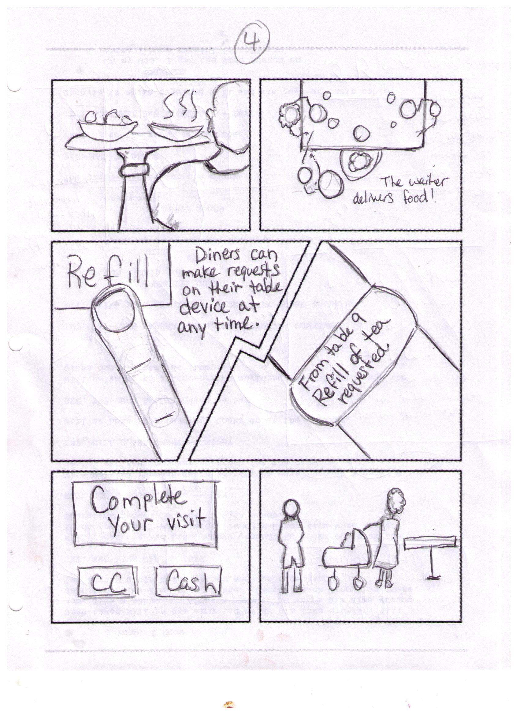
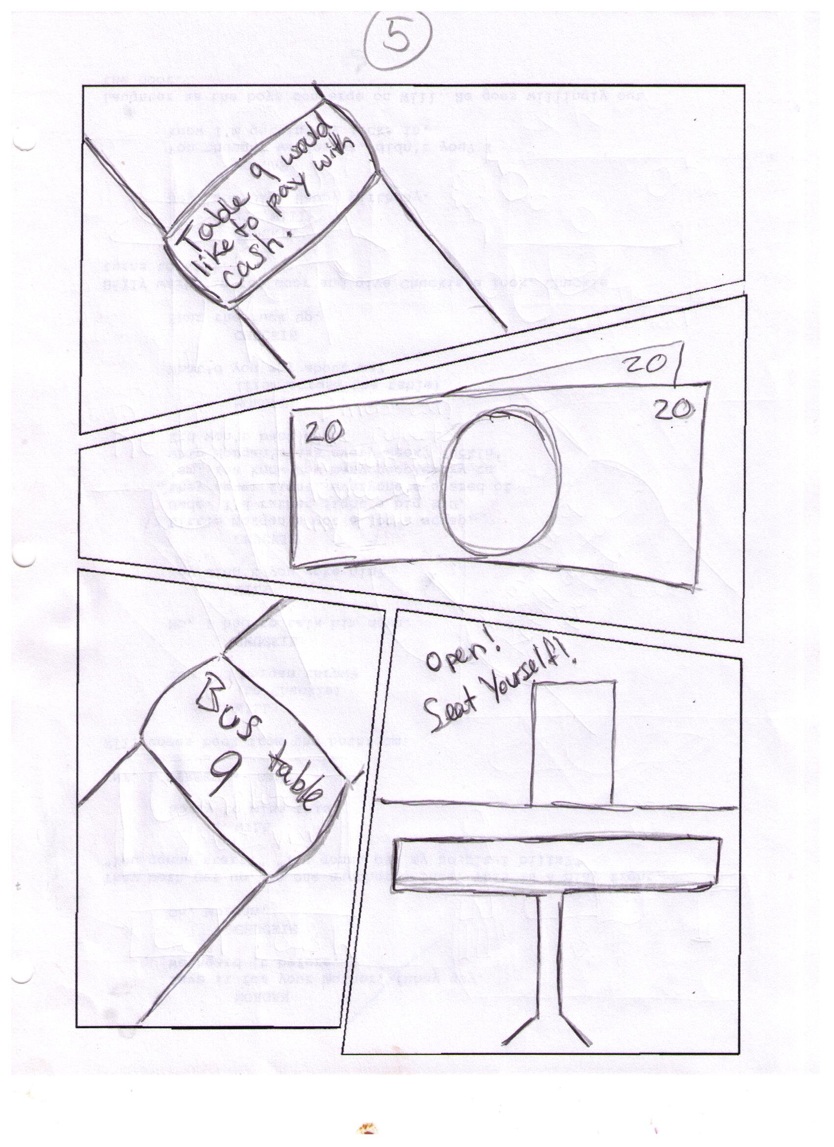
Wireframe Development Process:
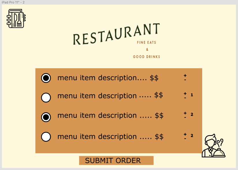
The user interface for Diner-ly was crafted with the intention of making the dining experience as streamlined as possible as some users might not be as tech-savvy as other users. Thus, a simple welcome screen with simplistic buttons to show the user either the “food” or “drinks” side of the menu was made. This display screen is the first thing that users see when they are seated at their table and is the same menu screen that they see when checking out the menu at the front of the restaurant while they are waiting sit or just want to see the menu. A simple color scheme was chosen so it would be straightforward for the user.
While many users might have questions or special dietary needs or requests, we made it possible for users to request a server at any point while navigating Diner-ly’s table interface. When viewing the menu, users can request multiples of said item and can access the menu at any time in order to get refills and the like. Similarly, they can review their receipt at any time in order to make the design interface transparent for the user at all times.
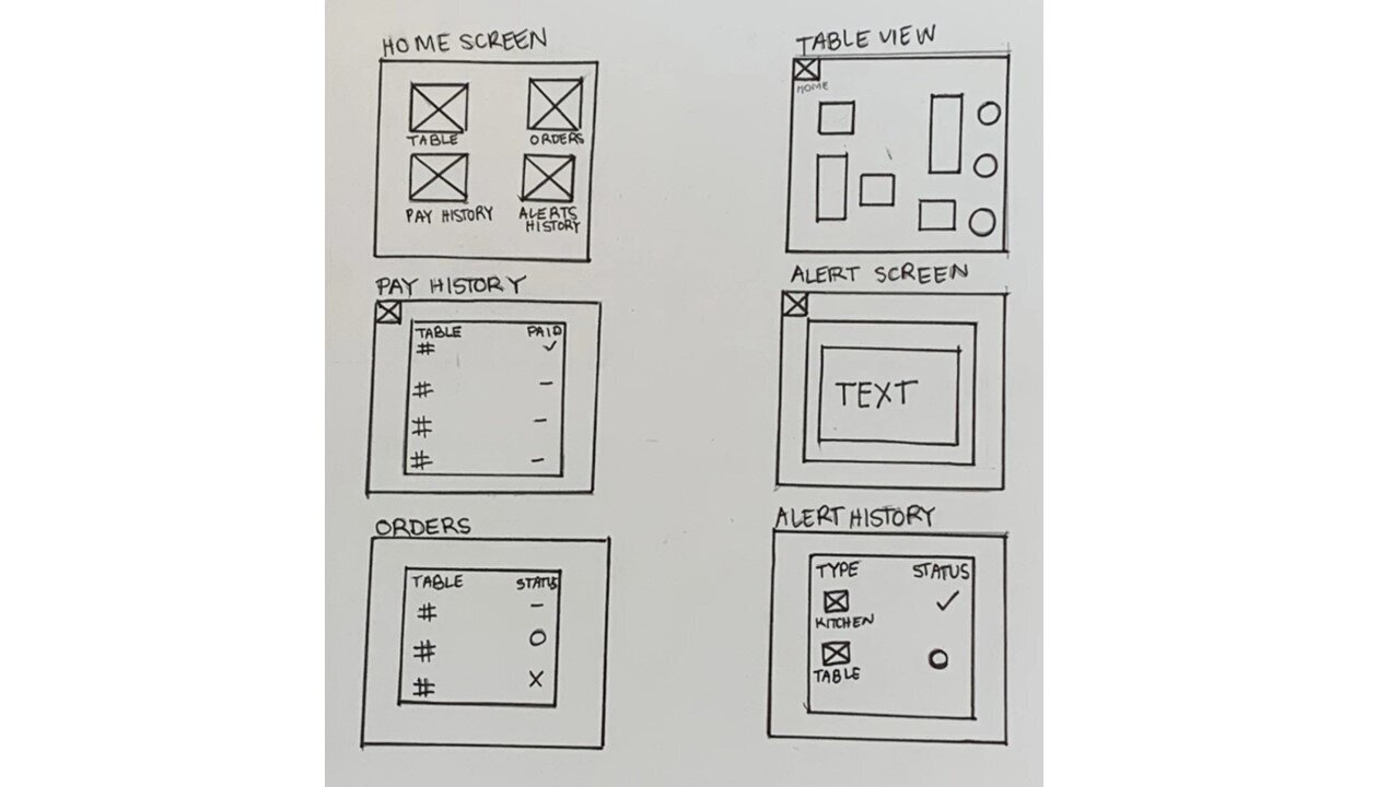
Server-ly, was intended to mitigate the back and forth aspect of the user group of waitstaff and restaurant staff. A wearable such as an Apple watch was chosen so that users wouldn’t have to constantly go back to a server’s station/terminal in order to find out more information on a table; there would be a consistent flow of communication and updates.
We chose the home screen to have the four following buttons: status, table status, pay status and alerts so that the waitstaff wouldn’t have to click through several buttons to get a comprehensive understanding of the restaurant. Waitstaff can change the status of any table at any time by holding down the blue table icon on the home screen instead of making another trip to the terminal to do the same thing which could potentially slow down the dining experience. This was necessary because sometimes the flow of the dining experience can be unpredictable and Server-ly needed to allow for such changes.
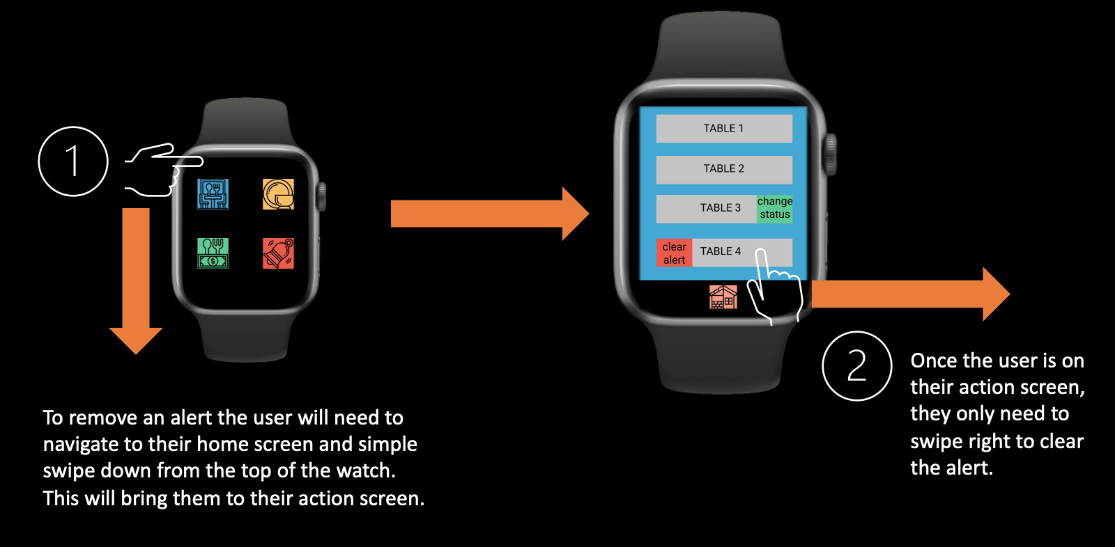
Alerts such a “call server”, “kitchen Alert” or “payment alert” is automatically sent to the wearable and pops up. If the server is busy, the red bell icon on the home screen allows for the user to get an overview of their tables in list format and immediately see which one has an active alert.
There is a table overview, accessed by tapping on the blue table icon, allows for the server to see the table layout graphically with color-coded alerts. Status is changed through the yellow icon and automatically updated by integration with Diner-ly or manually updated by holding down the yellow icon. This was necessary because some actions like “cleaning a table” need a way of being inputted as the diner would not do this. The green icon indicates the pay status of the tables which automatically changes in concurrence with what actions the diners do with Diner-ly. Similarly, the Server-ly user can change this status through the blue icon at any time to allow for flexibility within the dining experience overall.
Overall, with Server-ly the alert pop-up functions and the double tap to change status and clear alerts were added to allow for any organic scenarios that might happen at a given time in the dining experience journey. At the forefront of design for Diner-ly was the idea that ordering menu items be simplistic as possible and similar to familiar interfaces to the user such as delivery apps and websites.
Mid - Fidelity Wireframes


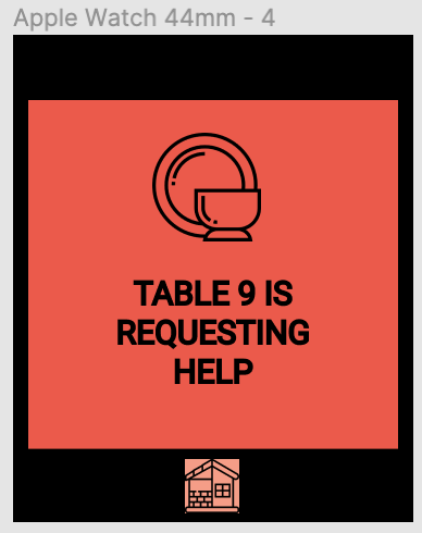

Interactive Design: Click Here!
Diner-ly:



Design changes through the iterative process and collaboration:
After the low-fidelity wireframes were created the team came together to discuss the many use cases scenarios that would apply to the dining experience. For Diner-ly, we needed to add a persistent help button so that diners could call for assistance during any step in the process. The only other change to Diner-ly was to add + and - symbols and a total quantity of items to the ordering menu for ease and it is familiar to other food ordering software.
Server-ly took more time to discuss because it is one of a kind, there are no other devices/software to compare it to. The first designs displayed many screens, one for order, one for payments, one for alerts, and one for history including all actions that have taken place. We decided that the actions on Sever-ly needed to be less cumbersome and provide quick helpful information.
The second big change that came up during our discussions was that the server was unable to perform any actions with the device besides reading the notifications. We knew that we needed to allow the server to clear alerts since it is their responsibility to take care of those tasks. The other interaction that was necessary for the server is to change statuses for diners. The system runs in a sequence and we know by talking through difference scenarios that there are exceptions to the sequence and there needed to be a way to account for those exceptions. These interactions spawned the action screen and the status adjustment screen. We also knew that the actions performed on the watch needed to be quick and easy due to the screen size and secondly the process should be efficient to not burden the server.
Use Case one: Removing an alert
Use Case Two: Changing a table's status
Final Thoughts and Future Improvements
Diner-ly and Server-ly are one-of-a-kind products that are the first version to make a dinning experience autonomous. User-centered thinking was key to making this product effective and only through collaboration on discussing the many use cases made this product great.
Future iterations of these products could build upon the help functionality by being able to provide prompts to the user and server to possibly handle questions more quickly.


